L'identité District 68
A brand built on one sentence
District 68 is a corner of Pierrefonds on Montréal's West Island. The name says both things at once: where we come from, and how we carry ourselves. Everything below exists to keep that intact on every garment, label and screen.
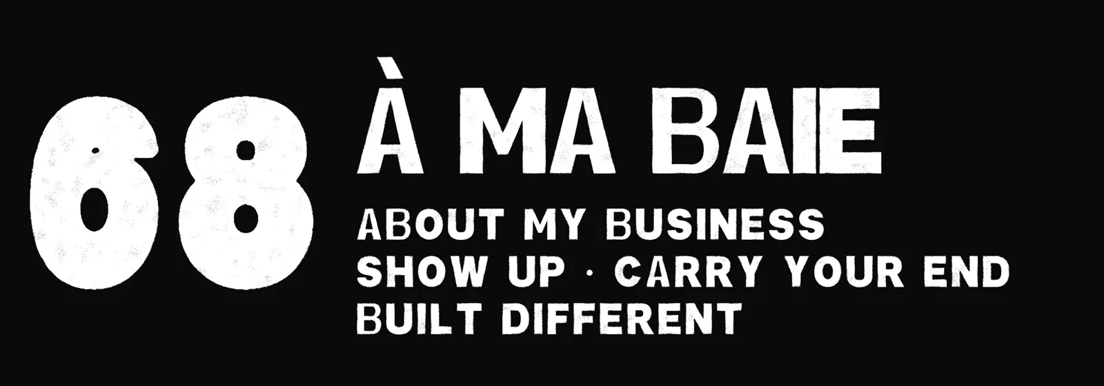
À-Ma-Baie, Pierrefonds, West Island. Named, not borrowed. The address is on the label because the address is the point.
About My Business. Head down, work first, no noise. The clothes say it once and stop talking.
Sport was the M.O. before it was a look. Athletic typography, team marks, one honest ink on a heavyweight blank.
01 / Les marques
The marks
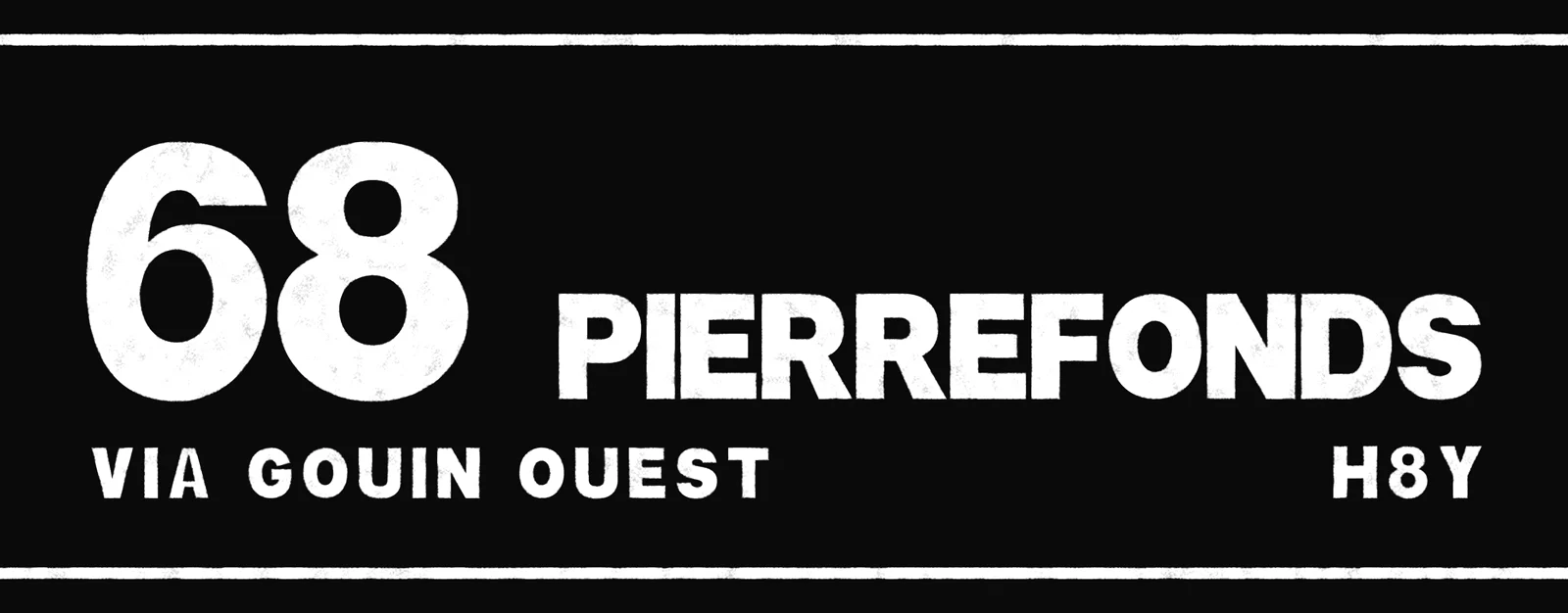
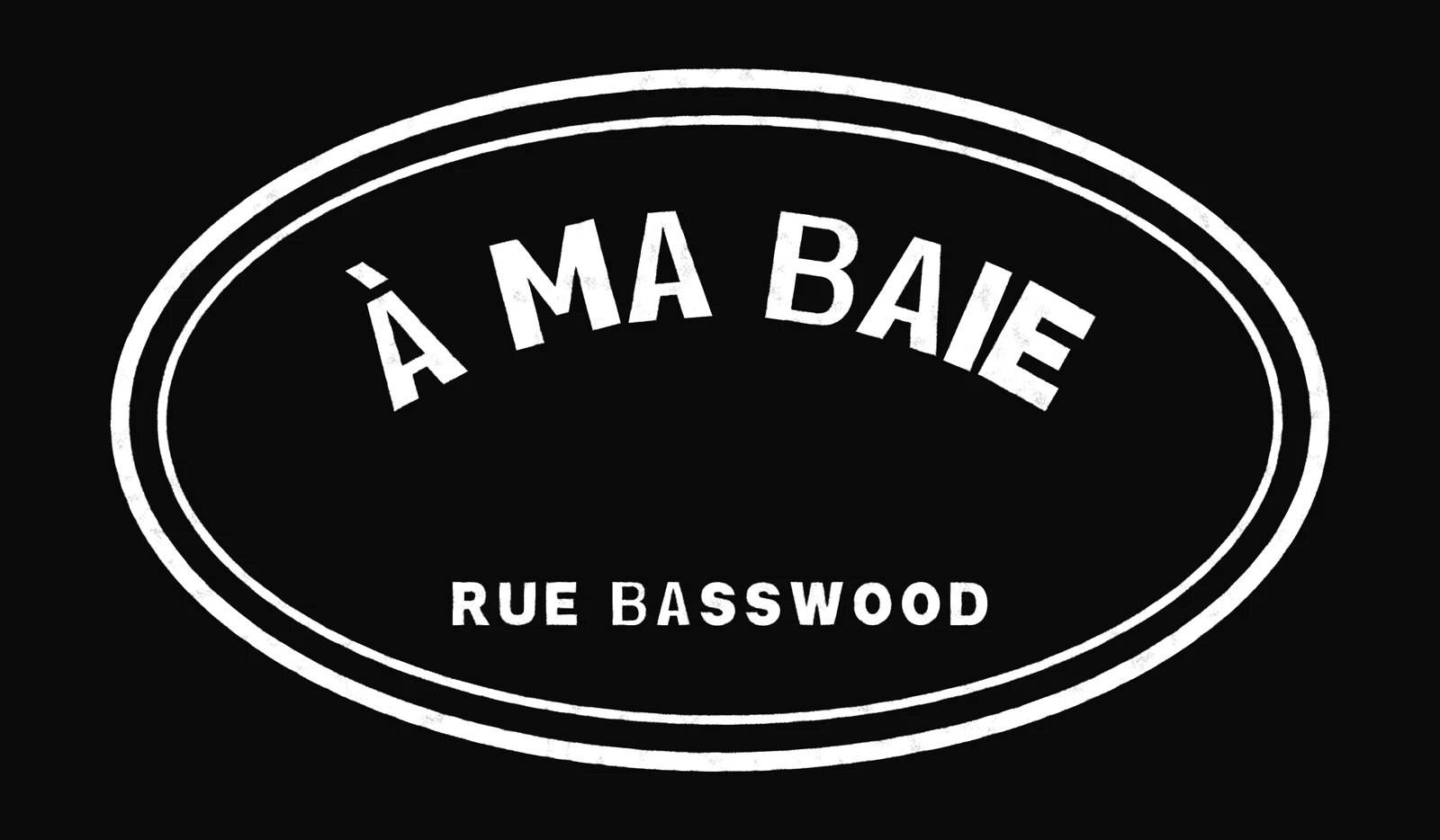
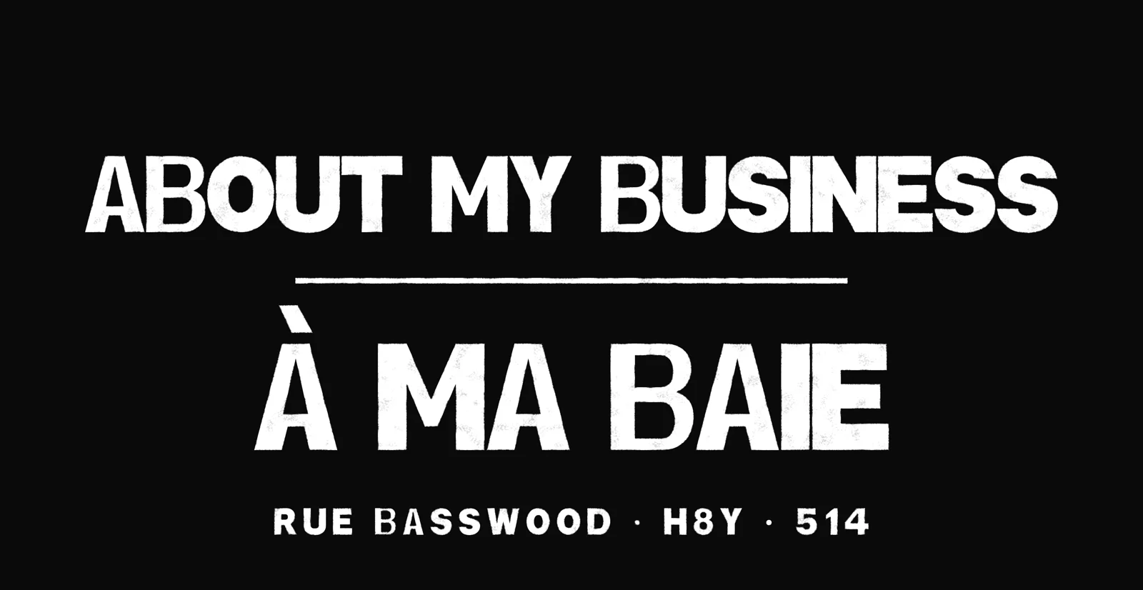
The 68 leads. Four supporting marks carry the name. Every one is built in three layers: extrude, keyline, fill.
The official logo. Bubble numerals with a white keyline and a black extrude, and an eagle's head cut into the shoulder of the six. It leads every application: loading screen, header, hang tag, chest hit, hardware.
Arched name over the block, rule, slogan. Labels, packaging, printed footers, the about page.
Sits in a 70px bar without shrinking. Site header, email, receipts, anywhere width beats height.
Face, keyline, black extrude. Avatar, favicon, cap front, left-chest hit.
Flat build so it survives small. Woven labels, stickers, inside the hood, hang tags.
02 / Respiration
Clear space and size
03 / La couleur
Three colours, no fourth
Bay Blue carries the brand. Ink Black holds the extrude and the body copy. Field White is the ground and the print.
#0E4269The brand colour. Marks, links, kickers, one-ink prints on light garments.#14181CHeadlines, body copy, the extrude layer, dark garment grounds.#FFFFFFThe page. Also the ink: white prints on every dark blank.- Print rule
- One ink per garment. Blue or black on light blanks, white on dark. Never two inks on the same piece.
- Screen tints
- Bay Blue lightens to #7FB2DA on black grounds only, for a second line of type. It is not a brand colour and never appears in a mark.
- Retired
- Gold, cream and royal are out of the system. So is any wave, ripple or water device under the letters.
04 / Le caractère
District Block
One display face, drawn for this brand. A condensed athletic block, corners barely softened, no serifs, caps only. Nothing borrowed.
05 / La voix
How it talks
Short sentences. Plain words. Facts you can check. The brand states things once and moves on.
We say
- About My Business. The slogan, spelled out, never abbreviated in copy.
- District 68. Accents kept. It is a place, not a style.
- Built Different. The creed line. Used on its own, never stacked with another claim.
- Printed to order in Montréal. Because it is, and it explains the wait.
- Made to order. A clear description of how each piece is produced.
We don't
- Sell the neighbourhood's hardship. The park stayed open. That is the story.
- Use hype words: exclusive, limited edition, drip, fire, must-have.
- Invent heritage. If a date or a number is on a garment, it is real.
- Shout in long copy. Caps are for the marks and the labels only.
- Use the em dash. Commas, colons and full stops carry the sentence.
06 / Le credo
Show up · Built different · Carry your end
Three lines, always in this order, always in District Block. They print as a back graphic and they set the tone for every piece of copy the brand writes.
07 / L'application
On the garment
- Zones
- Front and back only. These blanks carry no sleeve zone, so the brand does not fake one.
- Artwork
- Vector line, flattened to a single ink, checked at full print size before a garment is touched.
- Resolution
- 12 in wide at 300 DPI for back graphics, 11 in for front blocks, 4 in for left-chest hits.
- Sizing
- S to 3XL, unisex, boxy. Size down for a closer fit.
- Care
- Cold wash inside out, hang dry, no iron on the print.
08 / Première collection
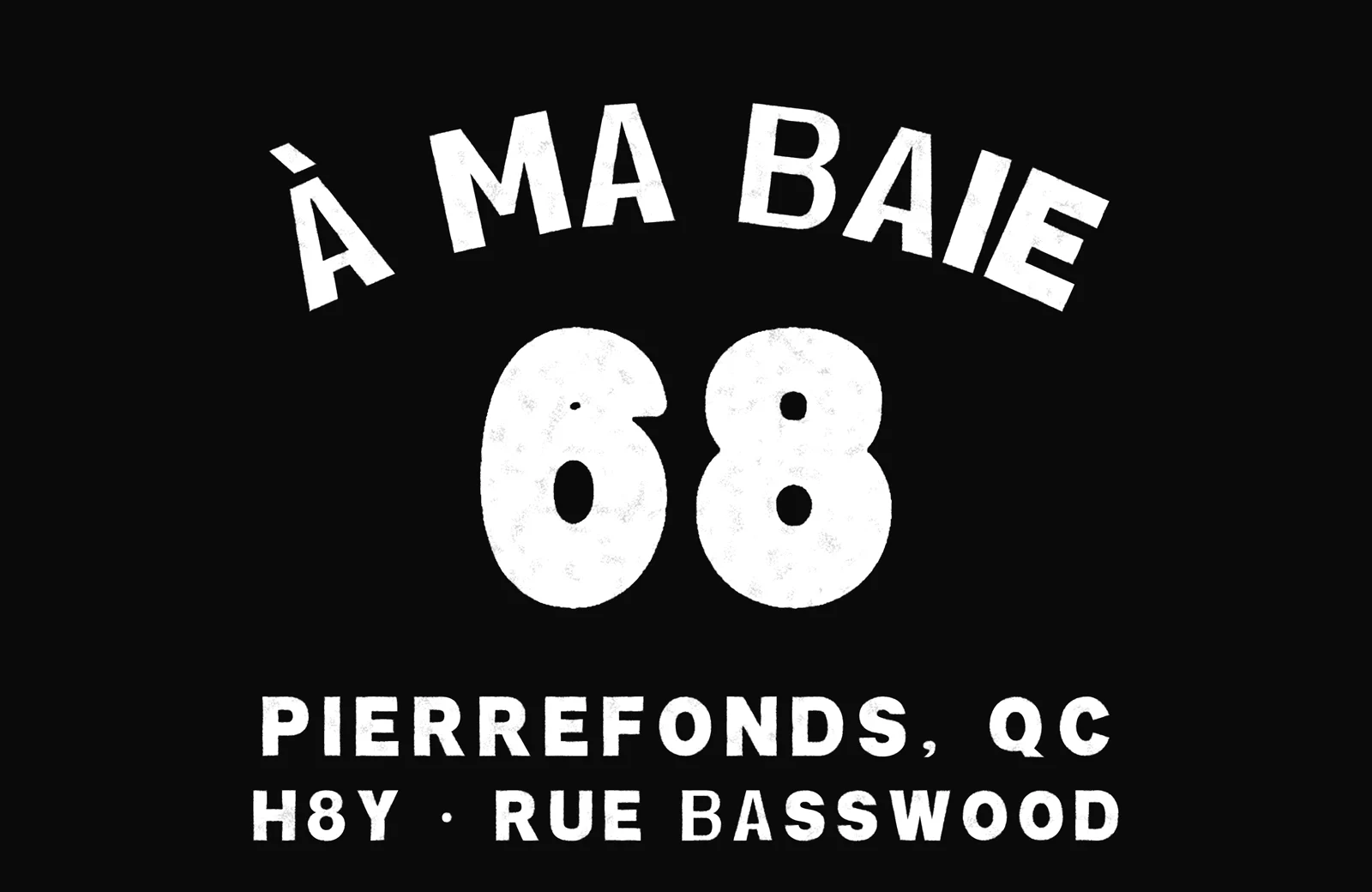
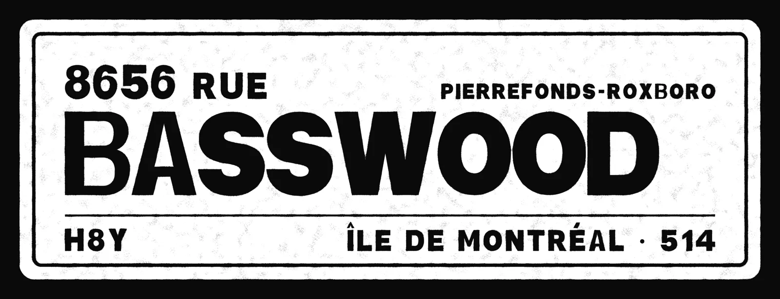
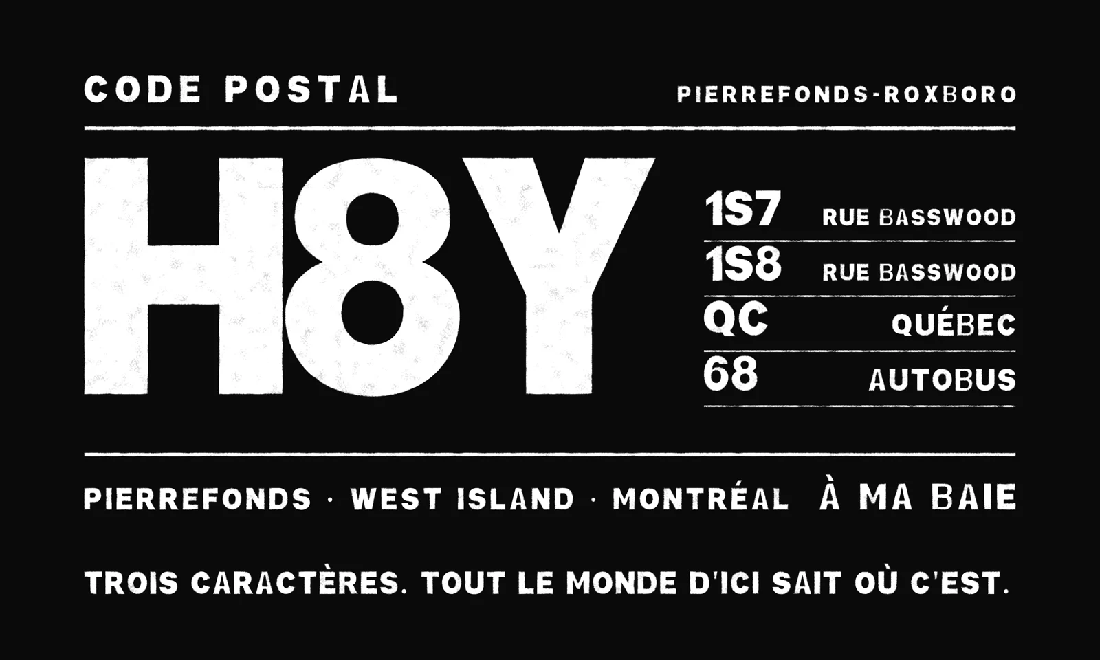
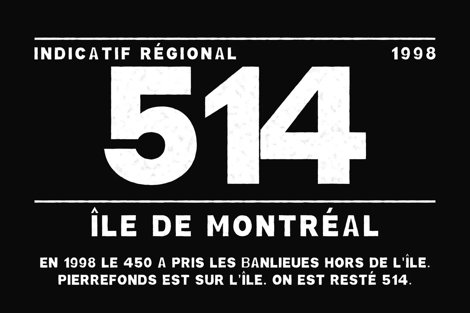
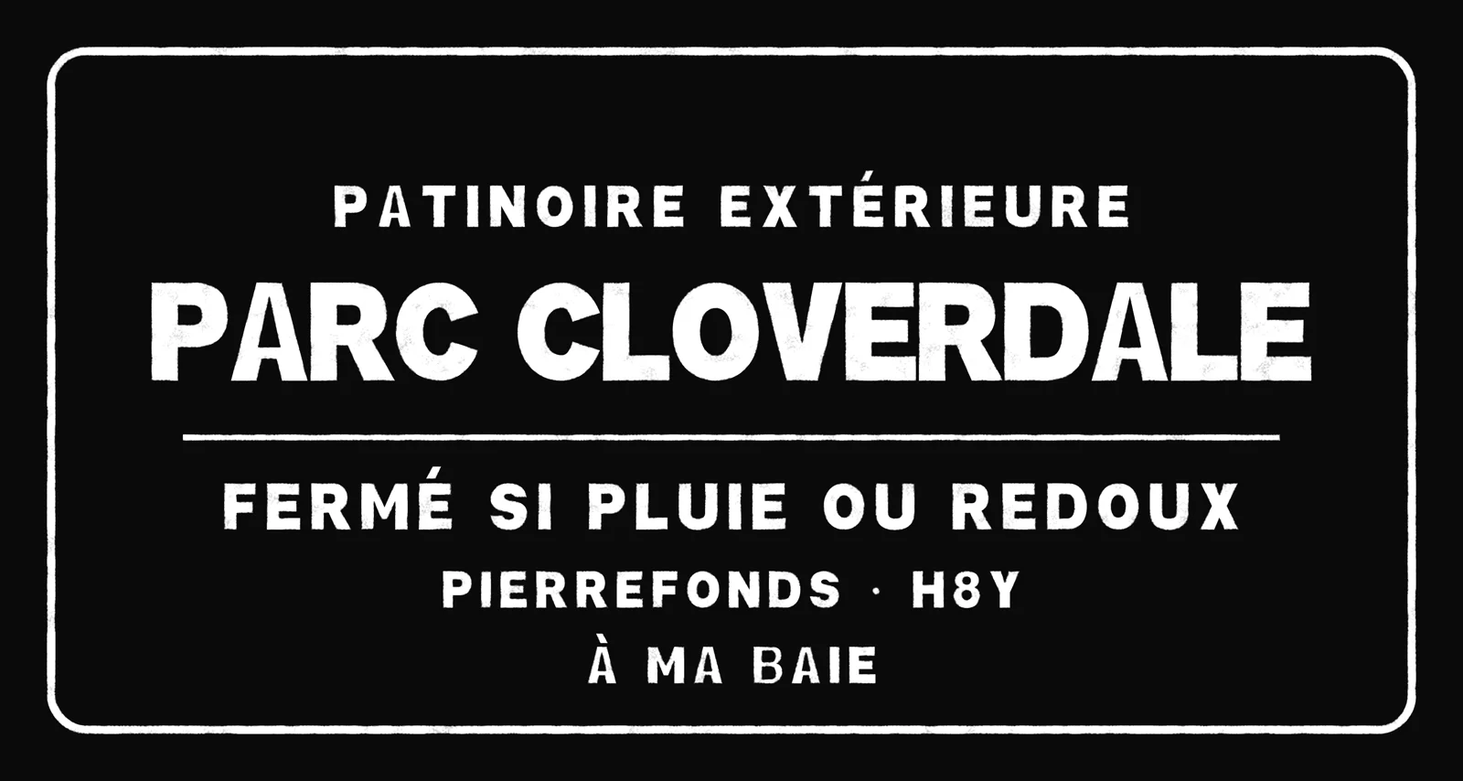
The print designs
09 / À éviter
Never do this
The marks are supplied as artwork. Place them, scale them proportionally, and change nothing else.
Do not stretch or condense the 68. Scale proportionally or not at all.
Do not rotate, arch or tilt the monogram. It sits level.
Do not recolour. Three colours exist. No gold, no red, no fourth.
Do not add glow, bevel or drop shadow. The extrude is the only depth.
Do not run the mark at low contrast or as a watermark over artwork.
Do not reset the name in another typeface. District Block or nothing.